


Our Services
Brand Definition
Audit (Assessing existing brand, audience and market)
Strategy (Identify opportunities, define direction, and plan strategically)
Definition (Differentiation, personality, purpose and attributes)
Identity (Mood/tone, visual approach, graphic style and logo)
Standards (Style guide, asset brand kits and AI prompts)
Creative Management
Brand (Ongoing strategy, practical application and extension monitoring)
Direction (Guiding teams for consistent execution)
Operations (Organization systems, staffing, process setup and maintenance)
Fractional (Filling temporary gaps in creative leadership)
Efficiency (Using AI and software to build self-serve efficiency across the organization)
Visual Design
Campaigns (OOH, print, digital, video, etc.)
Experiential (Conferences, events, booths, etc.)
Content (magazines, guides, podcasts, articles, posts, etc.)
Digital (sites, landing pages, emails, social, etc.)
Corporate (cards, letterhead, signatures, swag, etc.)
Presentations (sales, investor, templates, etc.)
Our Work
BRAND REFRESH LEADERSHIP

SALES BRAND MATERIAL REFRESH

REBRAND & MARKETING OPERATIONS

LUXURY BRAND CREATION

PRODUCT BRAND LAUNCH
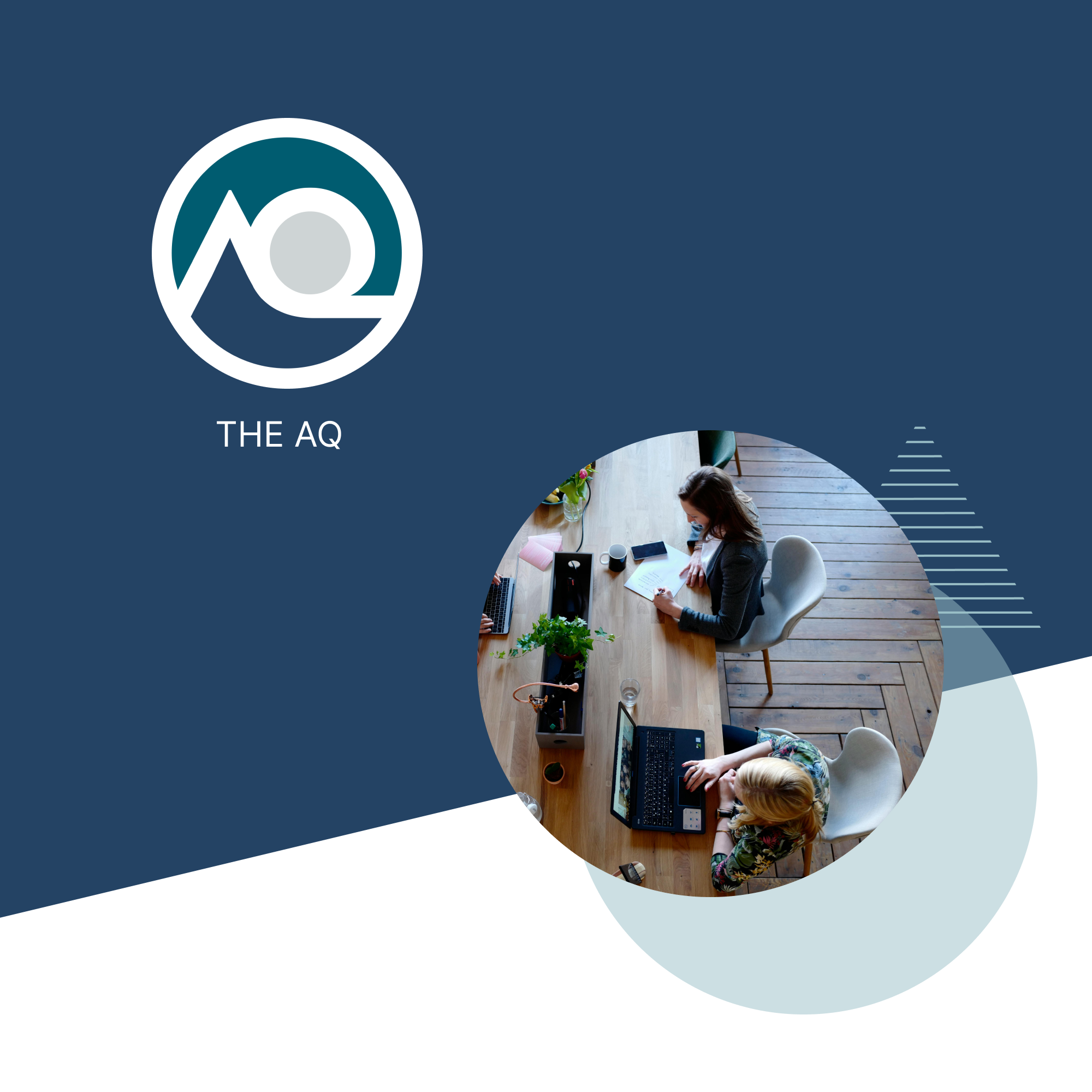
BRAND & COLLATERAL REFRESH
Our Clients

Lisa Boyars
SVP, Marketing, Motorsport Network
“One of my first priorities when I joined Motorsport was to refresh our Sales materials. Solidquality was able to make quick work of expanding our brand elements without reinventing them. The perfect way re-energize our business without a bigger rebrand.”

Derek Ries
CMO, OpenAsset
“Only Solidquality was able to produce a high quality brand in a short 8 week sprint for our new product launch. Resulting in our ACV doubling in the first months. We will be using Solidquality for our future branding needs.”
Daniel Head
CEO, Jacquard
“Solidquality was an essential resource during our rebrand, maintaining our prior brand while providing feedback to the agency developing our new brand. They also operationalized core assets and templates for the rebrand launch and beyond."
Our Story
Our Principles
Every element has a purpose and builds on the essence of the brand.
ORIGINAL
Unique and novel creative solutions for the goal of the project.
IMPACTFUL
Motivate and inspire the viewer into action to create meaningful results.
ACCESSIBLE
Have the ability to be accessible to all yet convey same level of meaning and impact.
CLEAR
Simple, minimal and modern. ‘No decoration for decoration sake.’
Our Collective
50+ creatives ready to go!
Extend our expertise across: design, illustration, typography, copywriting, content, video, photography and more.
Partnerships with other small consultancies.
We can manage vendor relationships for you—or introduce trusted partners directly.
Partner Agencies
MARKETING STRATEGY
VIDEO PRODUCTION
WEB DEVELOPMENT
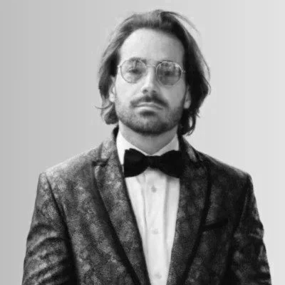
Our Founder
Alejandro Santandrea
Creative Director and Design Leader with 25+ years experience leading both in-house and agency creative teams to produce brand identities, system, content, and campaigns. Achievements include over 40 industry awards, launching an agency at Condé Nast and taking a tech ‘unicorn’ public.
Expertise built on experience with top brands:
